
BRANDING • SQUARESPACE WEB DESIGN • art direction
Start.Coop
Start.coop found us on LinkedIn while developing their Lean Co-op curriculum—a new educational offering for early-stage cooperative entrepreneurs.
From accessibility concerns to inconsistent branding, the materials weren’t quite holding up. What began as a single deck evolved into a broader creative partnership—reworking color and type, establishing core brand assets, and shaping materials that would reflect the energy and clarity of the curriculum itself.
As a fractional creative partner, we worked with Start.coop to bring cohesion and clarity to their brand system.
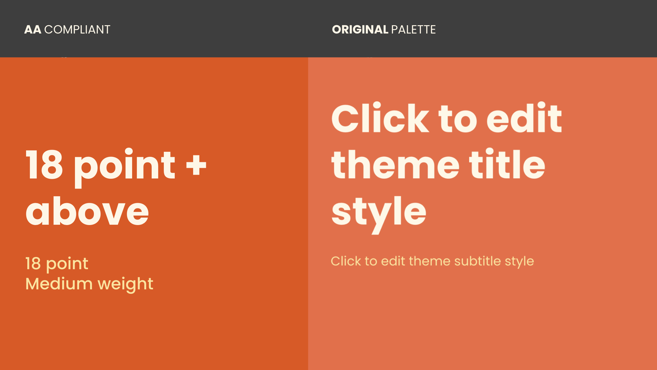
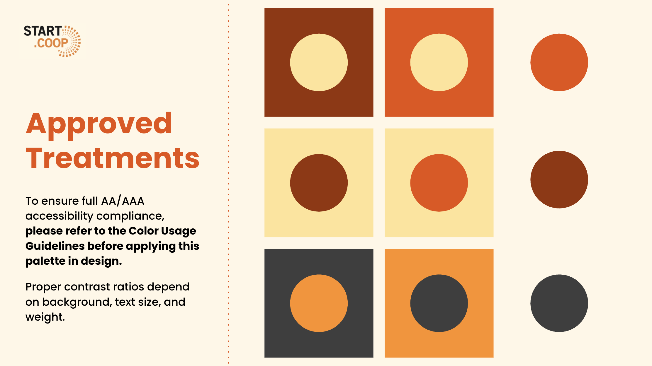
We refined the existing brand identity to improve accessibility and usability, including:
Revising the color palette to meet WCAG/ADA contrast requirements
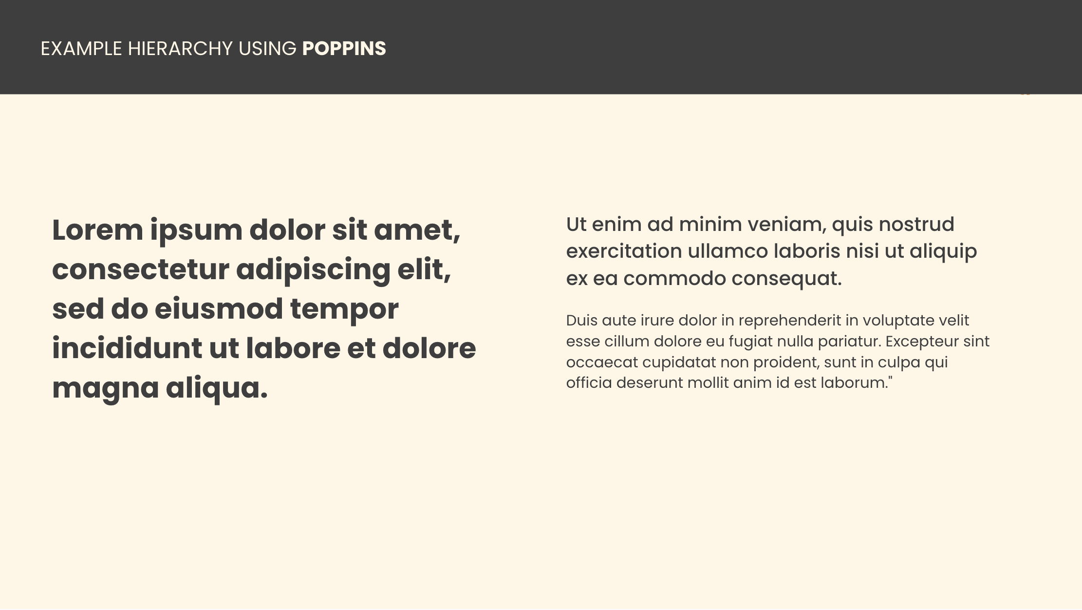
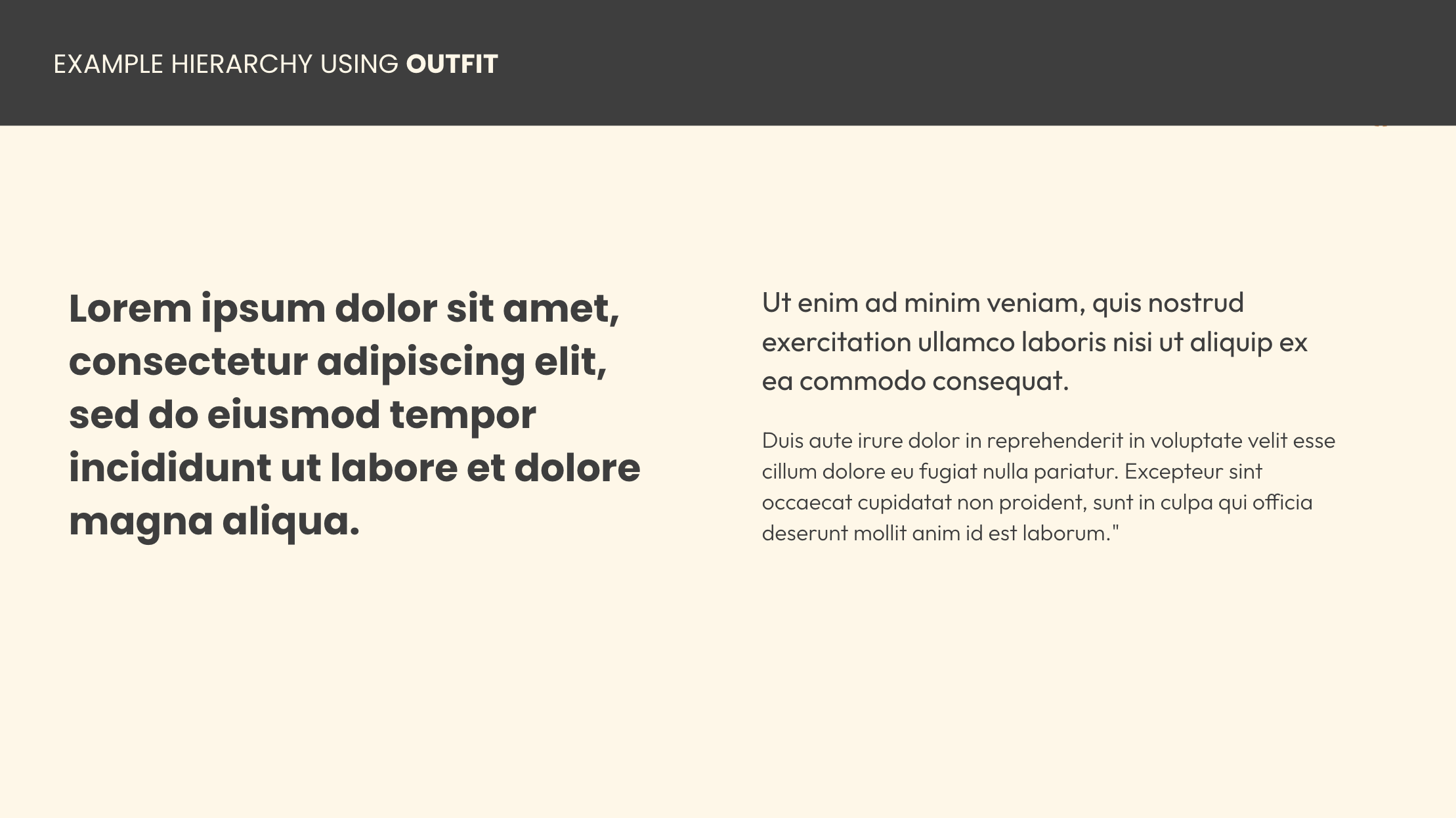
Introducing a secondary typeface to improve readability across decks and digital materials
Creating a foundational library of brand graphics, iconography, and text lockups to support core concepts
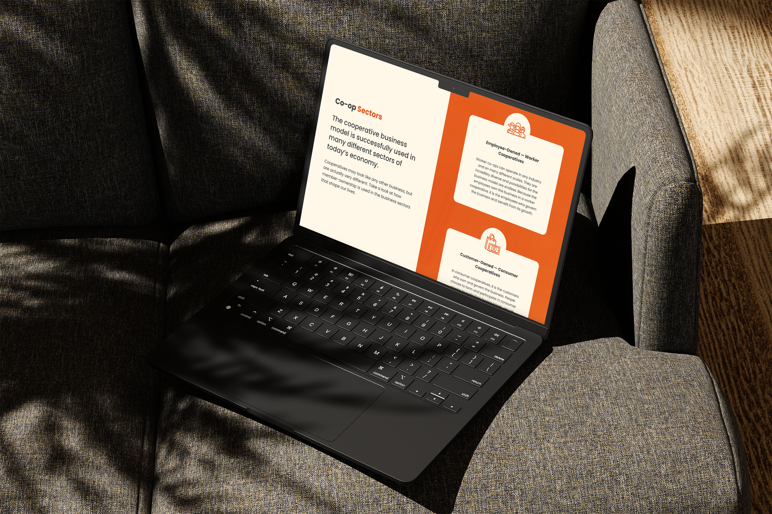
We designed a robust Google Slides template for the Lean Co-op curriculum, balancing structure with flexibility for educators and facilitators.
In addition, we provided:
Custom visual diagrams and supporting assets for core educational topics like governance vs. operations, and direct vs. representative democracy
A fundraising pitch deck to help secure support for the program and broader initiatives

FINAL PRODUCT & RESULTS
With a refreshed brand system and a consistent visual language across curriculum and presentations, Start.coop is better equipped to educate, inspire, and grow the next generation of co-op leaders.
Their team now has a flexible design system they can build on, backed by templates and tools that keep things looking sharp without reinventing the wheel.